How to Design a Sign People Can Read From the Road
 Daniel
October 31, 2026Updated November 3, 20268 min read
How Do You Design a Sign People Can Read From the Road?
A 24" × 18" 4mm Coroplast Yard Sign is $64.99. Artwork prep is $14.99 per item. Printed in the USA the next business day and shipped nationwide, flat $10 shipping to any US address. To read from the road, use one short message, dark letters on a light field or the reverse, and the biggest type it allows.
Design a road sign around one short message, two high contrast colors, big simple letters and plenty of empty space, then test it from where drivers will actually see it. A driver gets a few seconds at most, so the sign has one job: say who you are and what you want them to do, in that order.
Start by writing the sign's job in one sentence. Maple Street Bakery wants people to know it is open. Oak Street Realty wants buyers to turn at the next corner. Those are different jobs, and each needs its own wording. Do not force one layout onto every sign in a campaign.
A good first draft removes words before it adds decoration. Keep the words that name the business or the offer, and move the explanation to a flyer, a website or a sign where people can stop. Design for a glance, and remember the driver's attention belongs on the road.
| Sign element | Rule that keeps it readable |
|---|---|
| Main message | 3 to 7 words, the largest type on the sign |
| Name or logo | Big enough to recognize, smaller than the message |
| Contact | One line: a short web address or a phone number |
| Colors | Two, with strong light and dark contrast |
| Background | Solid color, no photo behind the words |
| Empty space | A clear margin on every edge and between lines |
What Should a Roadside Sign Say First?
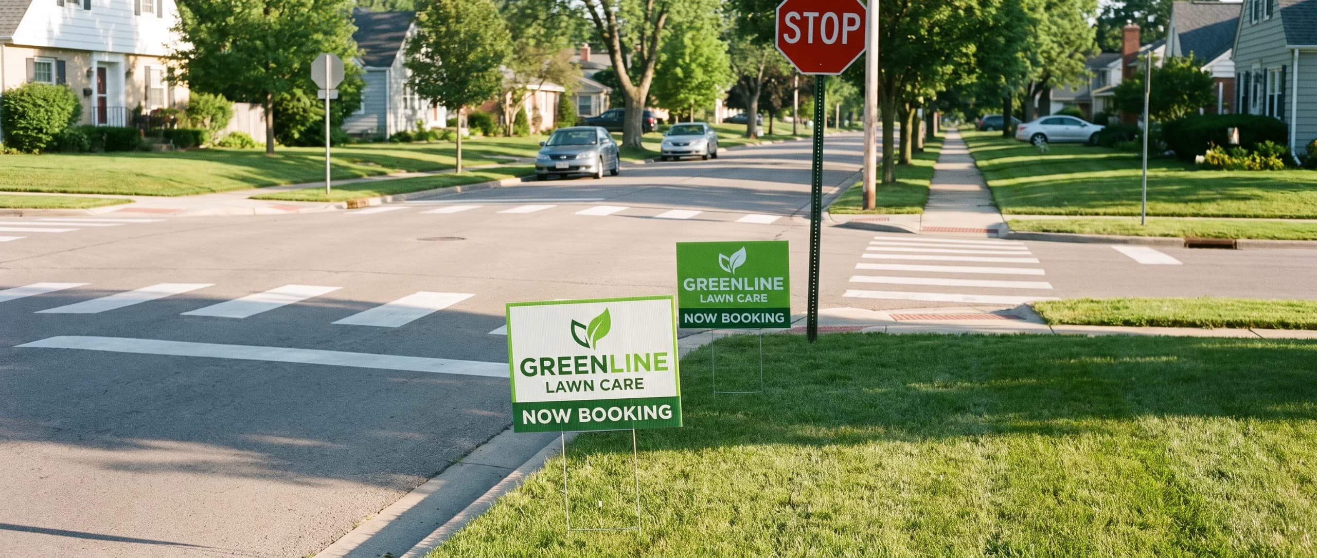
Lead with the words that answer the driver's first question. That might be the service ("Lawn Care"), the offer ("Now Booking"), the event ("Fall Festival Saturday") or the direction ("Open House, Turn Here"). If people do not know your business name yet, a plain service word is often worth more than a slogan.
Write three versions: the full explanation, a short one, and the few words you cannot lose. Start the layout with that last version. Keep the longer wording for a handout or the web page the sign sends people to.
Short does not mean vague. A slogan with no product in it is short and still fails. Show the draft to someone who has never heard of the business, give them three seconds, and ask what the sign is for. If they cannot say, rewrite it.
How Big Should the Letters Be on a Road Sign?
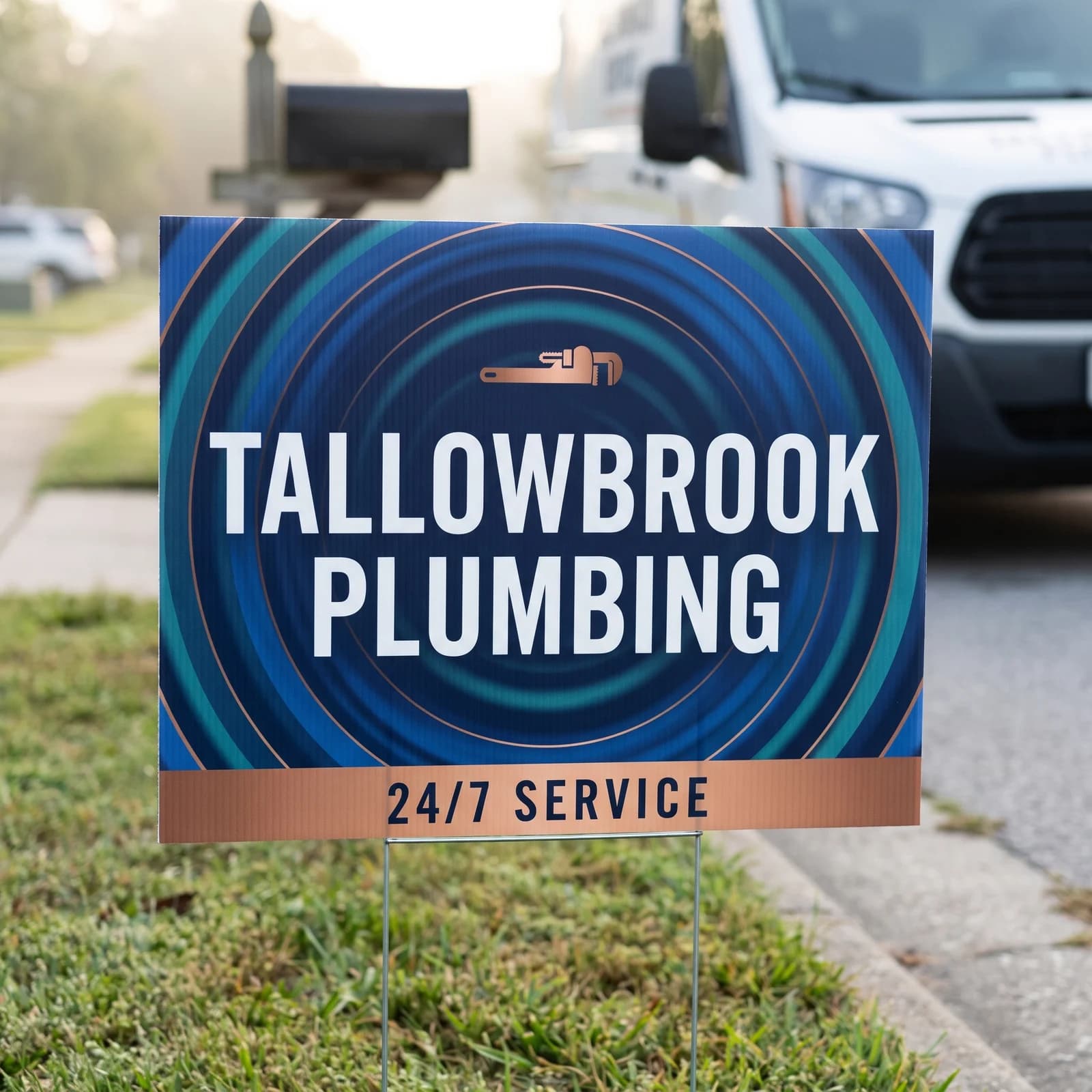
A common sign industry rule of thumb is about 1 inch of letter height for every 10 feet of viewing distance, so letters read from 50 feet should be around 5 inches tall. Treat that as the minimum for the main message, not the goal; speed, angle, light and clutter all make a sign harder to read than the rule assumes.
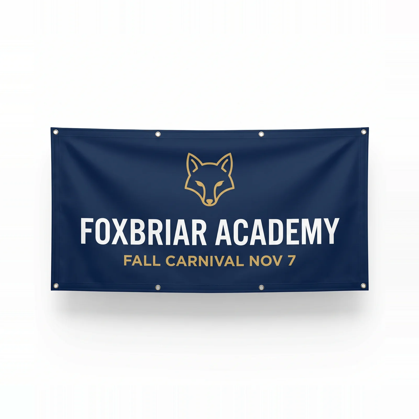
On an 18 x 24 inch yard sign, that math leaves room for only a few words at a useful size. That is why the best yard signs say a name and one line. On a 6 x 3 ft banner, the headline can be far larger, which is why a banner is the better choice when the reader is across a parking lot.
Measure capital letter height, not the font size number in your design app. A 72 point setting means different letter heights in different fonts. Print a strip of the headline at full size on letter paper, tape it to a wall, and step back to the reading distance.
Which Fonts Are Easier to Read on a Sign?
Plain sans serif fonts with a bold weight and open letter shapes are easiest to read on a sign. Script, thin, condensed and all caps decorative fonts look elegant on a screen and blur together at a distance.
Use one font family, two weights at most. Give letters a little extra spacing; tight spacing merges at a distance. Check the characters people confuse in phone numbers, such as 1 and 7, 3 and 8, 0 and O, and avoid styles where they look alike.
Upper and lower case usually reads faster than all capitals for anything longer than two or three words, because word shapes are easier to recognize. Save all caps for one short word such as "OPEN" or "SALE".
What Colors Make a Sign Easier to Read?
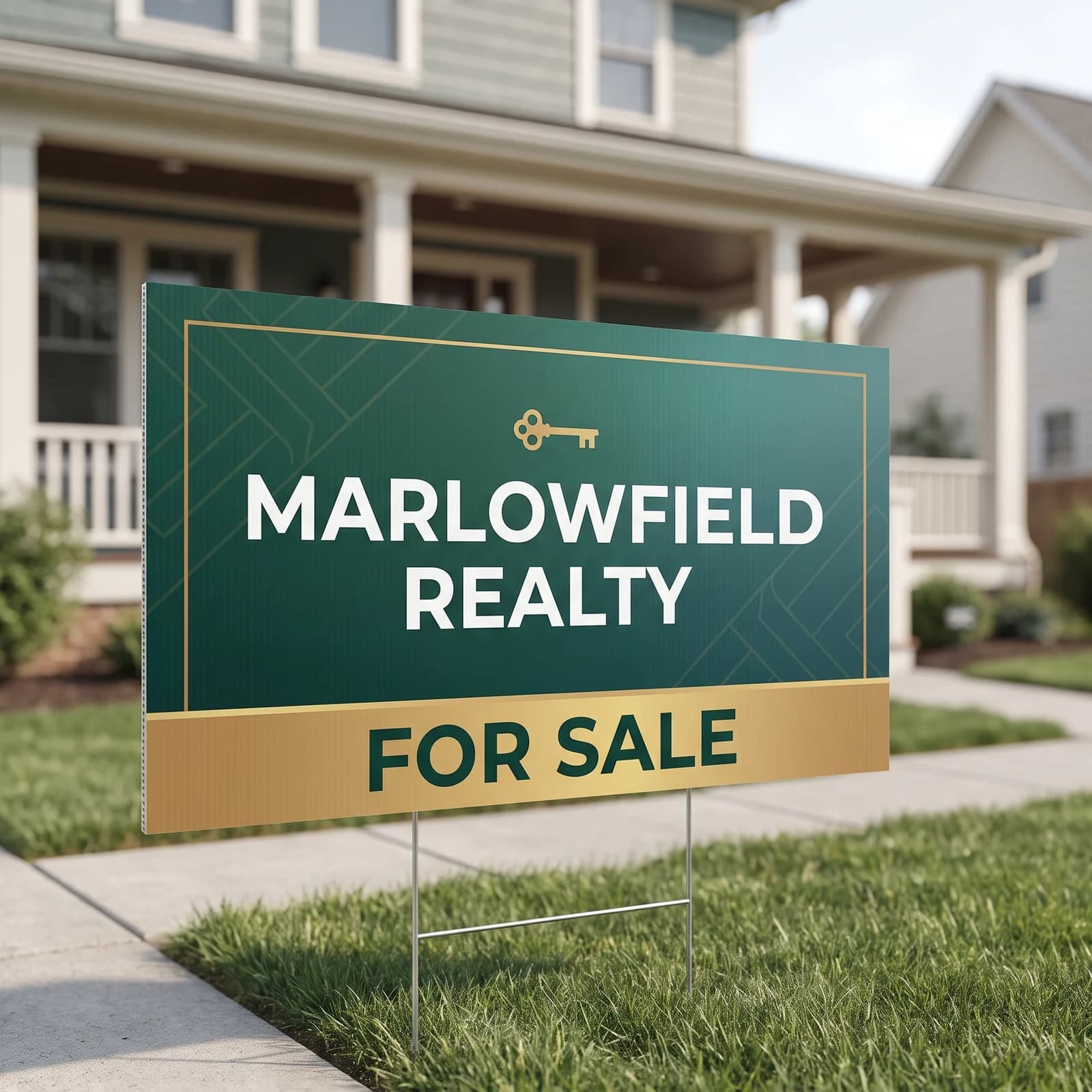
Pick two colors with strong light and dark contrast: dark lettering on a light background or light lettering on a dark one. Navy, black, dark green or deep red with white or yellow are reliable. Light gray on white, dark blue on black, and red on green are the classic failures.
Keep photos and textures out from behind the words. A photo background looks rich on a monitor and turns into noise at 40 feet, pulling contrast away from every letter. Put the photo beside the words or leave it off.
Think about what sits behind the sign. A green sign in a green lawn or a brown sign in front of a brick wall can disappear even with good contrast on its own face. A white or yellow field stands out in most outdoor settings.
How Do You Choose the Right Sign Size and Material?
Choose the size from the reading distance and the number of words, then choose the material for where it will stand. A yard sign carries a name and a line; a banner carries a headline across a storefront or a fence; a sidewalk A-frame talks to people on foot.
Yard signs start at $64.99 in 4mm Coroplast, the corrugated plastic made for lawns and roadsides, and the 18 x 24 inch standard yard sign is a common size to start with. Vinyl banners start at $64.19 and come in any width and height. Our yard sign sizes guide compares every size side by side.
Printing on both sides helps a sign that faces traffic from two directions. It does not fix a sign with too many words on each face.
How Do You Test a Sign Before Printing?
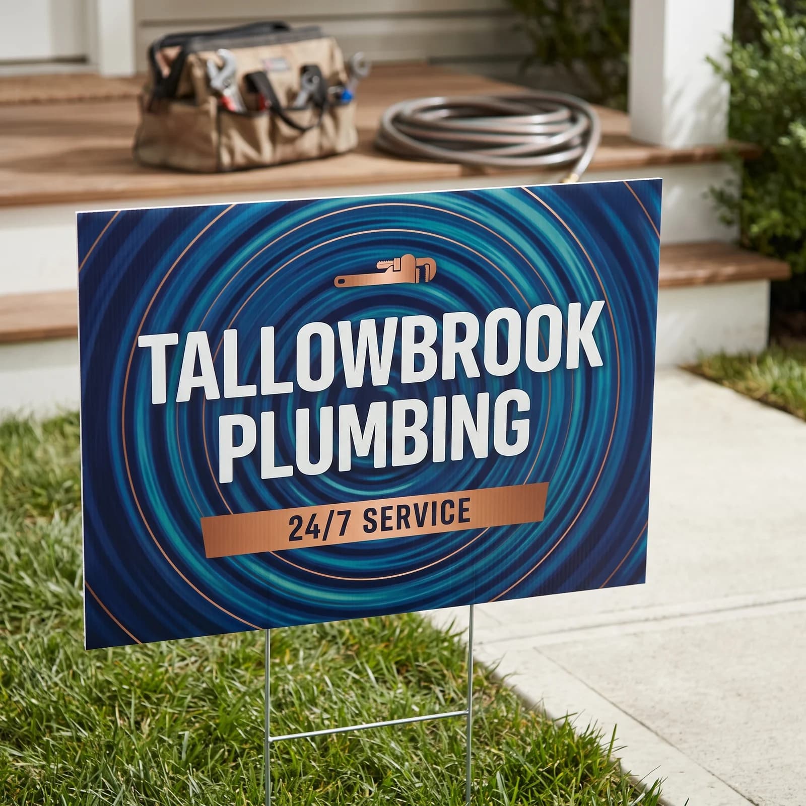
Test the sign at full size from the place drivers will see it. Print the headline on paper at actual size, tape it up, and look from the road or from the distance it will be read. Ask someone who has not seen the design to glance for three seconds and tell you what it says.
Check the approach from every direction. A parked truck, a tree, a mailbox or an open gate can block the important words. Our yard sign placement guide covers corners, setbacks and stake height.
Follow local rules and get the property owner's permission before you place any sign. Rules for signs in public right of way vary from place to place.
What to Check on Proofs for Road Signs
Check the word count first. A sign with a name, a slogan, five services, a phone number, a website and a QR code ends up with every line small. The fix: keep the name, one line and one contact, and move the rest to the website.
Next, check for low contrast: a logo color used for the headline on a background in a similar shade. It looks fine on a bright laptop screen and fades outdoors.
Then check for a file built at the wrong shape. An artwork made for a square social post placed on a 24 x 18 inch sign either crops or leaves empty bars. Build the canvas at the sign's size first. Every order comes with a free digital proof, and nothing prints until you approve it.
How Do You Order a Readable Sign?
Settle the message, the size and the placement, then order. Open the custom yard signs page or the vinyl banner page, choose the size and sides, and upload your design.
Send a ChatGPT or other AI image through AI image to print for $14.99 once per item, or choose Design it for me at $29.99 with two revisions. Yard signs are printed the next business day after approval and vinyl banners in 3 business days. Both are printed in the USA and ship to all 50 states for a flat $10 per product. Our print ready files guide covers bleed and resolution before you upload.
Frequently Asked Questions
3 to 7 words for the main message is a good target for a sign drivers pass at speed, plus a name and one contact line. Read it aloud in the time it takes to say one breath; if you run out, cut words.
1 inch of letter height for every 10 feet of viewing distance is a common sign industry rule of thumb, so a sign read from 50 feet wants main letters about 5 inches tall. Treat it as a floor, not a target, and test the real sign from the road.
2 colors with strong light and dark contrast read best: dark navy, green, black or red on white or yellow, or the reverse. Avoid light on light, dark on dark, and red on green, and keep busy photos out from behind the words.
1 contact line is usually the limit on an 18 x 24 inch sign. Pick the one people will remember, a short web address or a phone number, and make it big. Both on a small sign shrinks the headline.
No. A driver should never need to scan a code to get the message. Put a QR code where people stop and stand, such as a door, a counter or a sidewalk A-frame, and test the printed code before the order is final.
A 24" × 18" 4mm Coroplast Yard Sign is $64.99. Artwork prep is $14.99 per item. Printed in the USA the next business day and shipped nationwide, flat $10 shipping to any US address.
Related Articles
Yard Sign Placement for Traffic, Corners and Stakes
One 18 x 24 in double-sided yard sign is $64.19. A standard H-stake is $3.00. Face traffic and [...]
Read More: Yard Sign Placement for Traffic, Corners and Stakes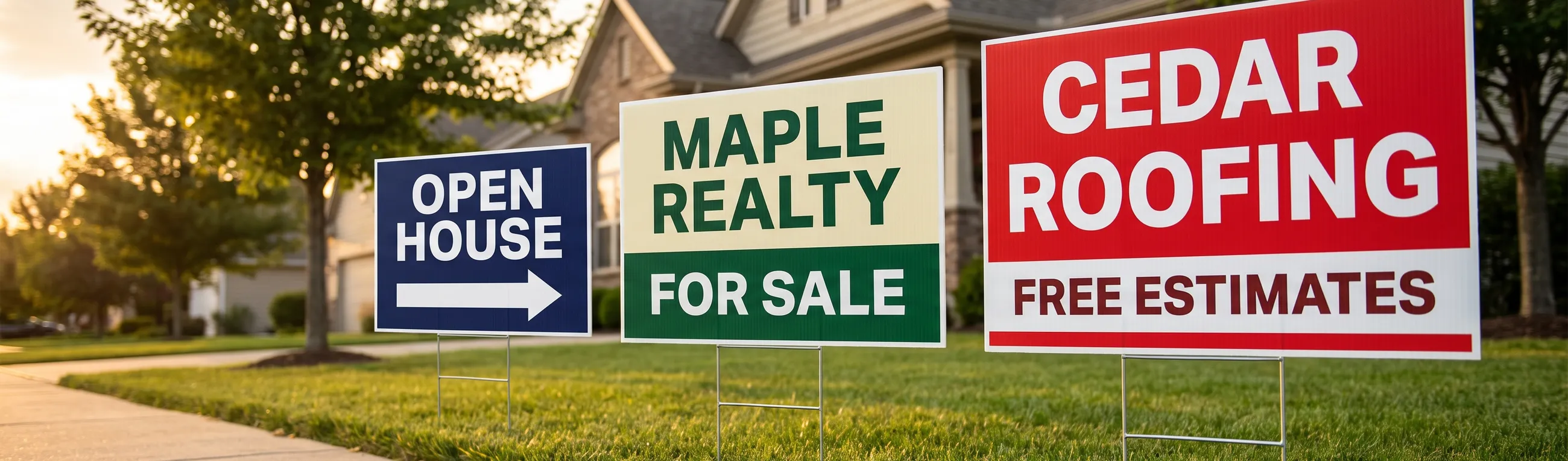
Yard Sign Sizes: 12x18 to 36x24 in, Bleed and Stakes
Standard yard sign sizes are 12x18, 18x24, 24x24 and 36x24 inches. Get letter height by [...]
Read More: Yard Sign Sizes: 12x18 to 36x24 in, Bleed and Stakes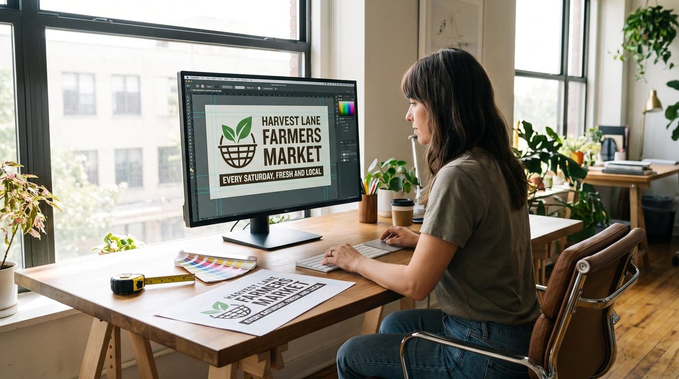
Banner Design Guidelines: Clear Artwork That Prints Well
Banner design guidelines start with a 6' × 3' layout, bold hierarchy, safe margins, and sharp [...]
Read More: Banner Design Guidelines: Clear Artwork That Prints Well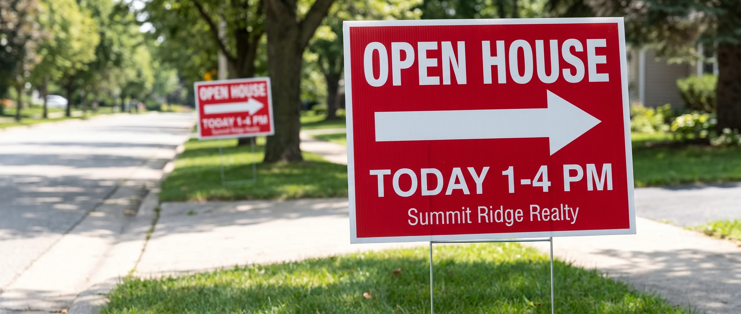
Open House Sign Design for a Clear Yard Sign Order
One 18 x 24 in double-sided open house sign is $64.19. Put OPEN HOUSE, one arrow, and a time on [...]
Read More: Open House Sign Design for a Clear Yard Sign Order