Best Fonts for Signs: Lettering and Color Contrast Guide
 Jean
October 31, 2026Updated November 3, 20268 min read
What Are the Best Fonts for Signs?
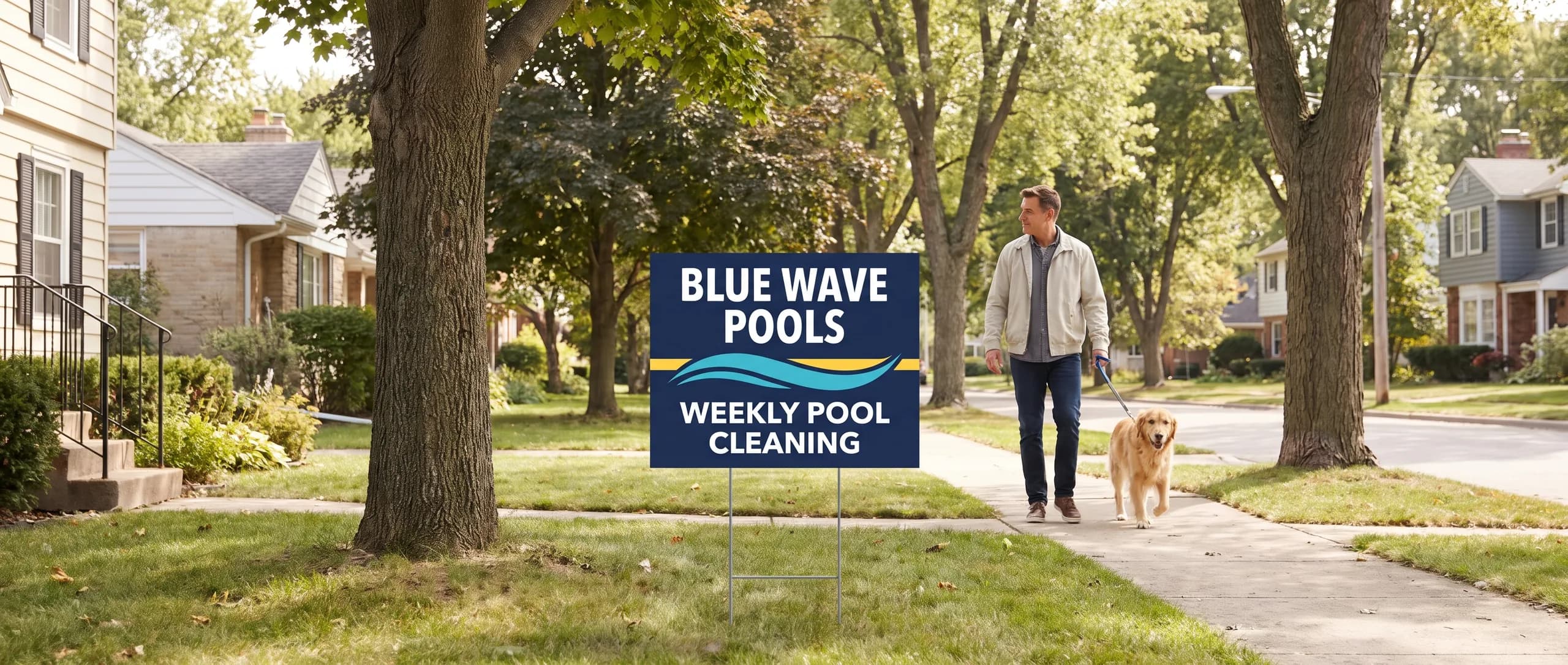
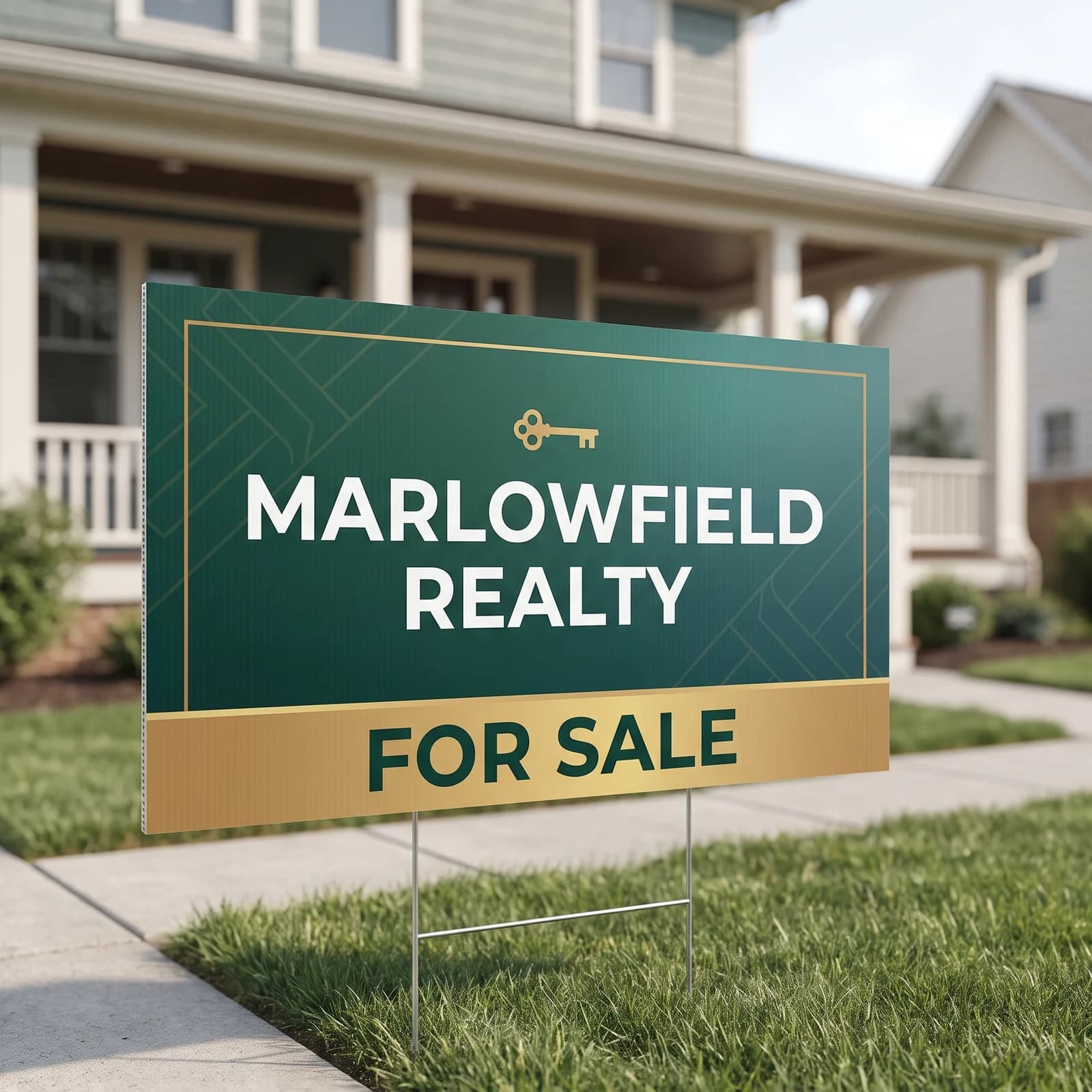
The best fonts for signs are bold sans serifs such as Arial, Helvetica or Montserrat, at about 1 inch of letter height per 10 feet of reading distance, with color contrast of at least 4.5 to 1. An 18 x 24 inch yard sign holds 4 inch letters and is $64.99, printed in the USA with flat $10 shipping.
The best fonts for signs are bold sans serifs: Arial Black, Helvetica Bold, Montserrat Bold, Futura Bold, Roboto Black and faces like them. Thick, even strokes and open letter shapes survive distance, glare and a quick glance from a moving car. Pair the right font with the right letter size and strong contrast and almost any sign reads.
| Font style and examples | On a sign | Use it for |
|---|---|---|
| Bold sans serif, such as Arial Black, Helvetica Bold or Montserrat Bold | Best | Headlines, phone numbers, names |
| Regular sans serif, such as Arial, Open Sans or Roboto | Good up close | Short supporting lines |
| Bold slab serif, such as Rockwell Bold or Roboto Slab Bold | Good | Headlines with a classic feel |
| Regular serif, such as Times or Garamond | Weak at distance | Avoid on outdoor signs |
| Condensed, such as Impact and other narrow faces | Fair | One word in a narrow space |
| Thin or light weights of any font | Poor | Avoid |
| Script and handwriting, brush and cursive faces | Poor | A logo only, never the message |
One font family in two weights is plenty: bold for the headline and phone number, regular or semibold for one supporting line. Mixing three or four fonts on one sign makes it harder to read, not more interesting.
How Big Should Letters Be on a Sign?
Use about 1 inch of capital letter height for every 10 feet of reading distance. Measure the height of a capital letter, not the font size in points, because point sizes vary between fonts.
| Reading distance | Capital letter height | Sign that fits a short headline |
|---|---|---|
| 10 ft | 1 in | Poster, A-frame, door sign |
| 20 ft | 2 in | 12 x 18 in sign |
| 40 ft | 4 in | 18 x 24 in sign |
| 60 ft | 6 in | 24 x 24 in sign |
| 80 ft | 8 in | 36 x 24 in sign |
The table also tells you how many words fit. An 18 x 24 inch sign with 4 inch letters holds two short lines plus a phone number. Ask it to carry six lines and every line shrinks below what a driver can read. When the message will not shrink, the sign needs to grow: a 36 x 24 inch sign is $79.99.
Which Letter Shapes Are Easier to Read?
Letters with a tall x-height, open counters and even strokes are easiest to read. The x-height is the height of a lowercase x compared with the capitals; a taller x-height makes lowercase words bigger at the same size. Counters are the open spaces inside letters like a, e and o; open counters keep those letters from filling in at a distance.
Watch for letters that look alike. In some fonts a capital I, a lowercase l and the number 1 are nearly identical, which is a problem in a phone number or a web address. A 0 and an O, or a 5 and an S, can also blur. Test your phone number in the chosen font at small size before you commit.
Should You Use All Capital Letters on a Sign?
Use capitals for a short headline of one to four words, and mixed case for anything longer. OPEN HOUSE, FOR SALE and NOW HIRING are fine in capitals. A line like Family owned since 1998, call for a free estimate reads faster in mixed case, because readers recognize the shape of familiar lowercase words.
Letter spacing matters more in capitals. Tight capitals touch and blur at a distance, so give them slightly more room than the font's default.
What Color Contrast Works Best on Signs?
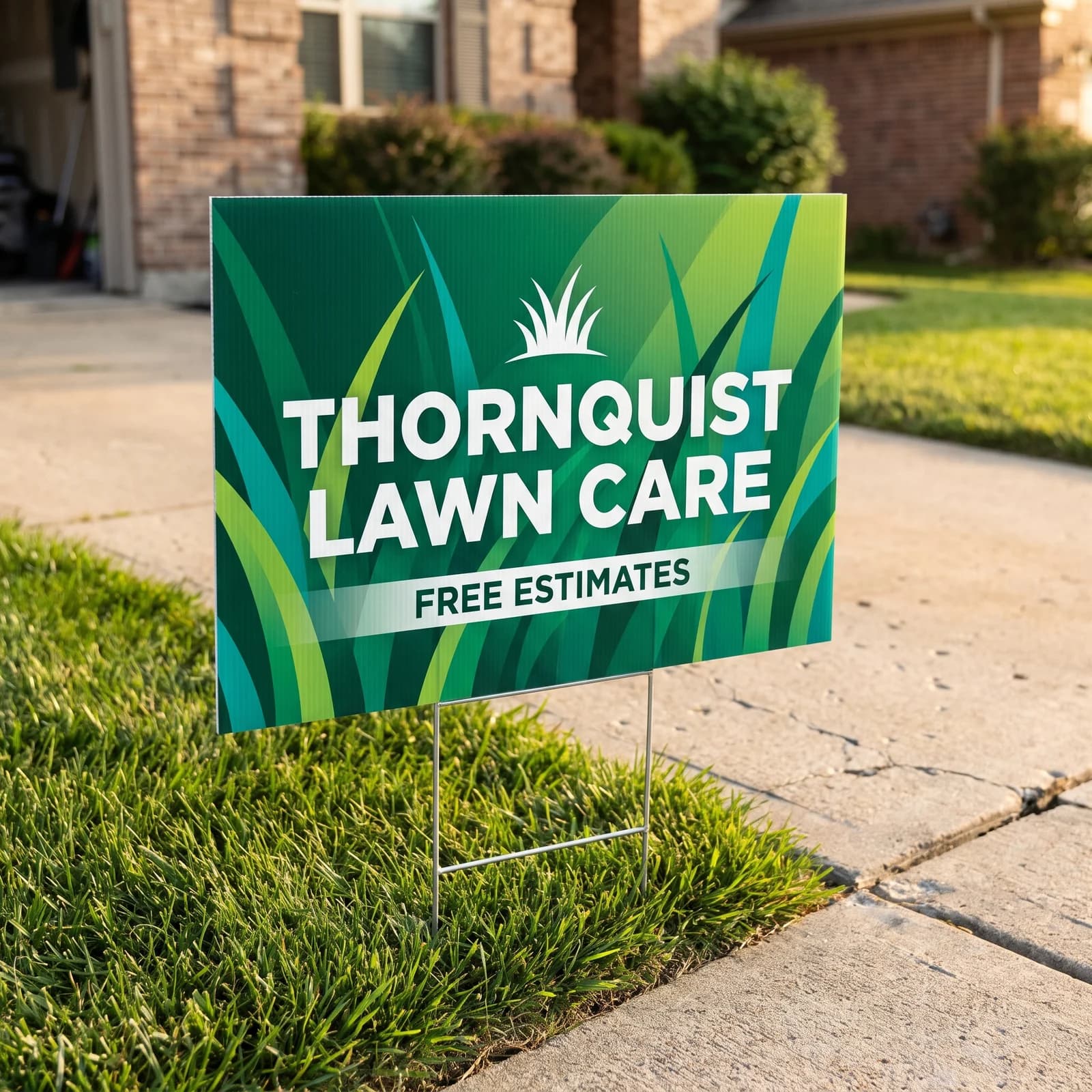
Dark letters on a light background, or light letters on a dark background, with a contrast ratio of at least 4.5 to 1. That figure is the WCAG level for normal text on screens, and it is a sensible floor for print; WCAG sets 3 to 1 as the minimum for large text. Outdoors, sun and distance wash colors out, so higher is better.
Exact ratios depend on the exact shades you choose, so check your own colors with a WCAG contrast checker. As a plain guide for common sign color pairs:
| Text on background | On a sign |
|---|---|
| Black on white | Excellent |
| Black on yellow | Excellent |
| Navy on white | Excellent |
| White on forest green | Very good |
| White on royal blue | Very good |
| White on deep red | Good |
| Red on black | Large text only |
| Orange on white | Poor |
| Light gray on white | Poor |
| Yellow on white | Fails |
| Red on green | Fails |
Red on green also fails for readers with red green color blindness, who may see the two as nearly the same color. Avoid that pair entirely.
Can You Put Sign Text Over a Photograph?
Put text on a solid color band, not straight on a busy photo. A photograph moves from light sky to dark grass to bright siding, and any letter color fails somewhere along the way.
Three layouts work: a solid color band across the photo with the text inside it, a dark overlay on the photo with white text over it, or a split layout with the photo on one side and the words on a flat color on the other. On an 18 x 24 inch sign, the split layout usually wins, because it keeps both the photo and the words big.
How Much Spacing Should You Leave Around Words?
Leave clear space around every line and at least 0.5 inch between any text and the edge of a sign. Crowded text reads as one block from a distance.
- Margins. Keep text and logos at least 0.5 inch inside the cut line, inside the safe area, so nothing is trimmed.
- Line spacing. Set line spacing at about 1.2 times the letter height, so lines do not run together.
- Letter spacing. Open up capitals slightly; never squeeze letters to fit.
- The stake zone. On a yard sign, keep the bottom 2 inches free of important text, because stakes and grass hide it.
- Empty space. Leave about a third of the sign empty. Empty space is what makes the words stand out.
What Should You Check in the Artwork Proof?
Check the proof at the size a reader will see it. Every order comes with a free digital proof, and nothing prints until you approve it.
Shrink the proof on your screen until the sign is about the size of your thumbnail; that is roughly how it looks from the road. If you can still read the headline and the phone number, the sign works. Then check the phone number digit by digit, confirm the letters that look alike, and read the contrast pairs against the table above. Permanent room and accessibility signs inside a building follow ADA rules for letter style and contrast, so check those rules before ordering that kind of sign.
How Do You Order Readable Signs?
Pick the sign size from the letter height table, set the headline in a bold sans serif, and choose a color pair from the contrast table. Then order the 18 x 24 inch yard sign at $64.99, the 12 x 18 inch sign at $64.99 for close reading, or the 36 x 24 inch sign for drivers. Each prints the next business day after proof approval and ships for a flat $10 to any US address.
If your artwork is a phone photo or a Canva file, AI image to print makes it print ready for $14.99 per item. Design it for me sets the type and colors for you from scratch for $29.99 with two revisions. The yard sign size guide draws every size to scale.
Frequently Asked Questions
A bold sans serif such as Arial Black, Helvetica Bold, Montserrat Bold or Futura Bold. Their strokes are thick, their letter shapes are open, and they hold up at a distance. Avoid scripts, thin weights and tightly condensed faces. An 18 x 24 inch yard sign is $64.99.
Use about 1 inch of capital letter height for every 10 feet of reading distance. A sign read from 40 feet needs 4 inch letters, which fit an 18 x 24 inch sign. A sign read from 80 feet needs 8 inch letters, which fit a 36 x 24 inch sign at $79.99.
Black on white and black on yellow are the strongest pairs. White on navy, forest green or a deep red also reads well. Avoid yellow on white, orange on white and red on green, which all fall under 3 to 1.
Aim for at least 4.5 to 1 between text and background, the WCAG level for normal text, and never less than 3 to 1, the level for large text. Higher is better outdoors, where sun and distance wash colors out.
Short headlines of one to four words read well in capitals. Longer lines read faster in mixed case, because the shapes of lowercase words are easier to recognize. Most good signs use a capitalized headline and mixed case for anything longer.
Only on a solid band or a dark overlay. Text set straight on a busy photo loses contrast where the photo changes from light to dark. Put the words on a flat color block and let the photo sit beside them.
Related Articles
How to Design a Sign People Can Read From the Road
Design a road sign around one 3 to 7 word message, high contrast and big letters. Yard signs [...]
Read More: How to Design a Sign People Can Read From the Road
Yard Sign Sizes: 12x18 to 36x24 in, Bleed and Stakes
Standard yard sign sizes are 12x18, 18x24, 24x24 and 36x24 inches. Get letter height by [...]
Read More: Yard Sign Sizes: 12x18 to 36x24 in, Bleed and Stakes
QR Code Size on Signs and Flyers: Distance and Placement
Size a QR code at one tenth of the scan distance: 1.5 inches on a flyer, 6 inches on a sign [...]
Read More: QR Code Size on Signs and Flyers: Distance and Placement
Print Ready Files: Bleed, Resolution and Color Guide
A print ready 6 x 3 ft banner file is 72.5 x 36.5 in at 100 to 150 dpi; a business card is 3.75 [...]
Read More: Print Ready Files: Bleed, Resolution and Color Guide