How to Make a Brochure: A Professional Print Guide
 Tomas Amaya
January 18, 2026Updated October 16, 202610 min read
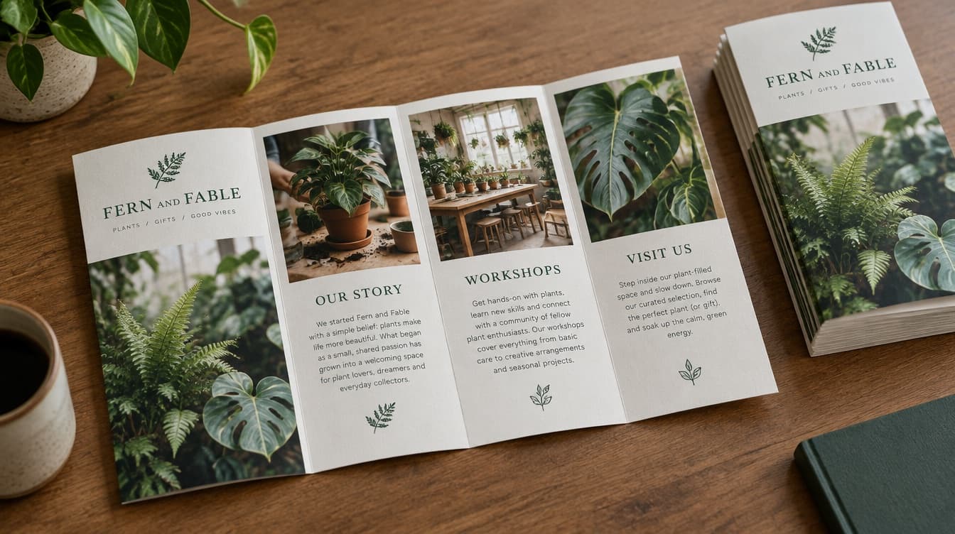
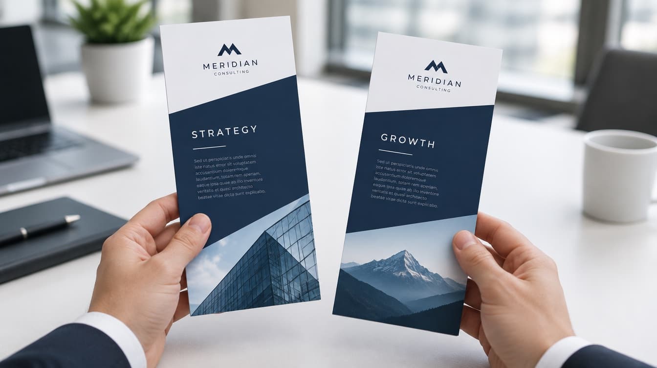
How Do You Make a Professional Brochure?
A professional brochure starts with the final fold: use four broad panels for a half-fold or six narrower panels for a tri-fold, assign one purpose to each panel, and place the offer and next step where they remain clear after folding. Build and review the artwork at final size before printing.
Start with the folded piece, not a blank page on a screen. A half-fold creates four broad printed panels. A tri-fold creates six narrower panels. That physical structure determines where the cover lands, what the reader sees first, how the inside message unfolds, and where the final next step belongs.
250 8.5x11 Half-Fold 70# Text Stock brochures are $246.09, which is about $0.98 a brochure. Printed in the USA in 3 to 5 business days and shipped nationwide, flat $10 shipping to any US address.
The live custom brochure printing page offers full-color printing on both sides of 70# text stock. Choose the exact sheet and fold before writing final copy. A layout built for four wide panels does not transfer cleanly into six narrow panels, even when both versions begin with an 8.5 x 11 sheet.
| Printed format | Folded structure | Printed panels | Best planning approach |
|---|---|---|---|
| 8.5 x 11 half-fold | One fold through the center | 4 | Use a cover, one broad inside spread, and a clear back panel |
| 8.5 x 11 tri-fold | Two folds across the sheet | 6 | Give each narrow panel one message and control the reveal order |
| 8.5 x 14 tri-fold | Two folds across the larger sheet | 6 | Keep the same six-panel logic with more room inside each panel |
Decide the format, label the panels by position, and only then assign copy and images. The brochure will feel intentional because every piece of content was written for the space where it will actually appear.
What Should Each Brochure Panel Do?
Each panel should complete one job. A panel can introduce the business, explain a service, answer an objection, show proof, present an offer, or tell the reader what to do next. It should not try to perform all six jobs at once.
For a half-fold brochure, think in four large moments. The cover earns attention. The two inside panels carry the main explanation as a spread. The back panel closes with contact information and the next action. The larger panel area can support a stronger photograph, a short comparison, or a more detailed service explanation.
A tri-fold needs tighter assignments because its panels are narrow. One useful sequence is cover, opening idea, three inside points, and close. The exact order changes with the folding direction, so label the outside and inside positions on a paper mockup before placing final content. That simple check prevents a strong headline from landing on a flap nobody sees first.
Keep continuity across the folds without forcing every sentence to cross them. A photograph can span an inside spread when the subject remains clear at the crease, but body copy is easier to read when it stays inside one panel. Treat the folds as part of the design, not as lines added after the layout is finished.
How Should Brochure Copy Be Written?
Brochure copy should lead with the reader's decision, then support it with proof and a clear next step. The cover does not need a company history. It needs a useful promise, a recognizable image, and enough context for the right person to open the piece.
Inside, use plain language. Name the service or offer, explain who it is for, and state why it matters. Short paragraphs work better than a wall of text because the reader is holding a folded piece, scanning one panel at a time. Specific headings such as "Three ways we help property managers" are more useful than broad labels such as "Our solutions."
Proof belongs near the claim it supports. That may be a short credential, a concise customer quote supplied by the business, a real project image, or a compact fact the business can verify. Do not fill empty space with unsupported superlatives. A restrained brochure feels more credible because every sentence has a purpose.
End with one primary action. The brochure can include a phone number, web address, email address, or QR code, but the wording should tell the reader what happens next. "Request an estimate" is clearer than "Learn more" when the real goal is an estimate. One decisive direction beats several competing calls to action.
How Should Brochure Artwork Be Organized?
Organize the artwork around the printer's selected format and the final folded positions. Create a labeled outside view and a labeled inside view. Use names such as front cover, back panel, inside left, inside center, and inside right so reviewers can discuss the same location without guessing.
Build a visual hierarchy that survives at actual size. Headlines should be easy to find. Body copy should remain comfortably readable. Images should support the message instead of becoming a background behind small type. Keep logos, faces, contact details, and other important elements away from fold lines and trimmed edges according to the artwork guidance supplied for the order.
Consistency matters across the whole sheet. Use the same heading system, body style, color palette, and image treatment from cover to close. A reader should understand that every panel belongs to one business, even when the content changes. Full-color double-sided printing gives the artwork room to carry a complete identity, but more color does not require more clutter.
Review the brochure folded, not only flat. A flat proof shows the print surface. A folded mockup shows the reading experience. Check which panel becomes the cover, whether the inside sequence makes sense, and whether any sentence depends on a panel the reader will not see yet.
How Does the Fold Define the Panel Plan?
The selected fold defines the panel plan. Available formats include half-fold and tri-fold brochures in 8.5 x 11 and 8.5 x 14 sheet choices. That product fact has a direct design consequence: panel count and panel shape must be settled before layout.
These brochures use 70# text stock, print in full color on both sides, and enter a 3 to 5 business day production window after artwork approval. None of those facts decides what the brochure should say, but each one belongs in the planning brief before the file is finished.
A half-fold provides broad panels and a central spread. A tri-fold provides a paced sequence of narrower panels. The content should respond to that difference instead of treating every brochure as one generic format.
Half-Fold: Four Printed Panels
One fold through the center of the sheet creates four printed panels, two on each side. In the outside view below, the back cover sits on the left and the front cover on the right. Open the brochure to read the two inside panels together as one spread.
Panels close toward the cover.
SOLMERE STUDIO is sample artwork. The animation begins on the inside spread so each printed reverse appears as the paper closes. Use the template supplied for your selected size and fold.
Trifold: A Letter Fold With Six Panels
Two folds create six printed panels. For the letter-fold orientation shown below, the outside view places the tuck-in flap on the left, the back cover in the center, and the front cover on the right. The tuck-in panel is slightly narrower so it can close inside the other panels. Use the supplied print template for the exact fold positions.
Panels close toward the cover.
SOLMERE STUDIO is sample artwork. The animation begins on the inside spread so each printed reverse appears as the paper closes. Use the template supplied for your selected size and fold.
Z-Fold: Panels That Open Like an Accordion
A Z-fold has six printed panels with two folds running in opposite directions. The sheet opens like an accordion instead of tucking one panel inside another. That sequence can carry a step-by-step explanation across three adjacent inside panels. The illustration shows one opening direction; check the cover position with a folded paper mockup.
Panels alternate direction.
SOLMERE STUDIO is sample artwork. The animation begins on the inside spread so each printed reverse appears as the paper closes. Use the template supplied for your selected size and fold.
Gate Fold: Two Flaps That Meet in the Middle
A gate fold uses two outer flaps that each cover about one quarter of the flat sheet. Both fold inward over the wider center panel and meet at the middle. The closed front cover spans the two flaps, while opening them reveals the inside spread. Allow the clearance specified in the print template so the flaps close cleanly.
Both flaps meet at the center.
SOLMERE STUDIO is sample artwork. The animation begins on the inside spread so each printed reverse appears as the paper closes. Use the template supplied for your selected size and fold.
The brochure product page currently offers half-fold and tri-fold formats. The Z-fold and gate-fold diagrams explain other panel arrangements; they are not selectable formats on that product page.
How Should a Service Business Plan Its Brochure?
A service business brochure for referral meetings should not list every service. It should explain who the business helps, make its process understandable, answer one important trust question, and direct the reader toward one next step, such as requesting a consultation.
An 8.5 x 11 tri-fold can divide that sequence across six short panels. The cover names the audience and benefit. The opening flap explains what the company does. Three inside panels cover the process, core services, and verified trust information. The back panel carries the contact route and one instruction.
Write to those assignments instead of dropping an old web page into the template. Each heading should stand alone. Photographs should show the intended audience and service setting. Contact information can appear once in the closing area rather than on every panel. The result is easier to scan because the fold and the message support each other.
When a detailed program overview needs a broad visual comparison, the half-fold may be the better choice. The decision comes from the job the printed piece must do, not from a belief that one fold is always more professional.
What Is Included, and How Should You Prepare to Order?
The brochure product includes 70# text stock, full-color printing on both sides, and the fold selected with the format. Available choices run from 8.5 x 11 half-fold through 8.5 x 14 tri-fold. Production takes 3 to 5 business days after artwork approval, and shipping follows production.
Before ordering, settle four things: the sheet and fold, the quantity, the labeled panel map, and the final artwork. Check that the outside and inside views match the selected format. Confirm that the cover is truly the cover after folding. Read every contact detail at actual size and make sure the primary action is unmistakable.
Upload the artwork that matches the chosen format. The approval point matters because the production window begins after artwork approval, not while copy, images, or panel positions are still being decided. Planning backward from the distribution date should account for both production and shipping.
Which Brochure Mistakes Should You Avoid?
Avoid designing before choosing the fold. It creates rework because a four-panel story and a six-panel story are not interchangeable. Avoid treating all panels as equal, too. The cover, opening view, inside sequence, and back panel each meet the reader at a different moment.
Do not shrink type to rescue overcrowded copy. Cut repetition, move secondary information elsewhere, or give the brochure one narrower purpose. Do not let a fold split a phone number, web address, face, or essential sentence. Do not place three competing actions on the closing panel and expect the reader to choose the one the business prefers.
Another common mistake is approving the flat file without checking a folded mockup. A panel may look balanced on screen and still open in the wrong order. Finally, do not describe materials or production timing from memory. Use the current product facts for the stock, print sides, available formats, approval point, and turnaround.
How Do You Move From Plan to Printed Brochure?
Choose the fold, label the panels, write one purpose for each, and finish with one clear next step. Then review the brochure at actual size and in its folded order. That sequence turns a collection of copy and images into a piece someone can understand while holding it.
When the file is ready, choose the format and order custom brochures. Select the exact sheet and fold used in the artwork, submit the final file, and complete artwork approval so production can begin.
Frequently Asked Questions
Choose a half-fold when four larger panels suit the message. Choose a tri-fold when six narrower panels make it easier to separate services, proof, details, and the next step. The selected fold should be final before copy and artwork are placed.
The live brochure product runs from 8.5 x 11 half-fold through 8.5 x 14 tri-fold. The 8.5 x 11 sheet is also available as a tri-fold. Select the exact sheet and fold combination before building the panel map.
The brochures use 70# text stock. They are printed in full color on both sides and folded to the selected layout. The stock, print sides, and fold are part of the product configuration rather than separate assumptions.
Use enough copy to complete one job per panel. A cover may need only a headline and image, while an inside panel can explain one service or answer one objection. If a panel needs several unrelated headings, divide or shorten the message.
Production takes 3 to 5 business days after artwork approval. Shipping follows production, so the approval date is the useful starting point when planning for a campaign, event, meeting, or distribution date.
The back panel should make the next action easy. Use the business name, the most relevant contact route, and one clear direction. Keep it readable when the brochure is folded, and avoid turning the panel into a second services list.
Related Articles
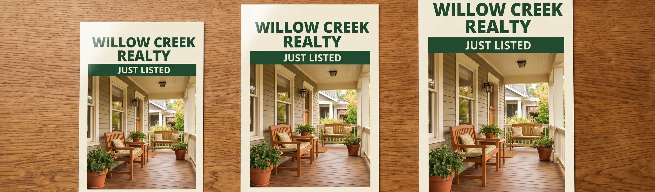
Postcard Sizes: 4x6, 5x7, 6x9, Bleed and USPS Rules
Standard postcard sizes are 4 x 6, 5 x 7 and 6 x 9 inches. Retail postcard pricing ends at 4.25 [...]
Read More: Postcard Sizes: 4x6, 5x7, 6x9, Bleed and USPS Rules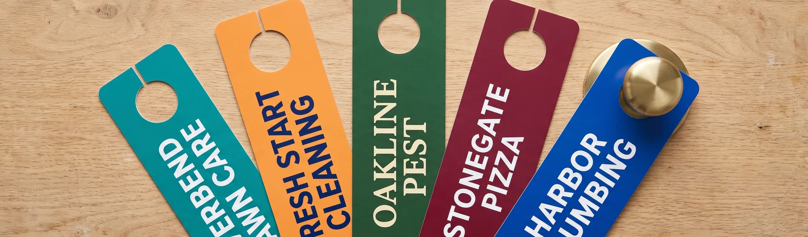
Door Hanger Sizes: 3.5x8.5 and 4.25x11 in, Die Cut Rules
Standard door hanger sizes are 3.5 x 8.5 and 4.25 x 11 inches. Compare pack prices, bleed, safe [...]
Read More: Door Hanger Sizes: 3.5x8.5 and 4.25x11 in, Die Cut Rules
What Information Should Be on a Business Card? 6 Essentials
A business card needs 6 things: name, title, company, phone, email and website. What belongs on [...]
Read More: What Information Should Be on a Business Card? 6 Essentials
Questions to Ask Before Buying Business Cards: 10 Answered
Ask 10 questions before buying business cards: stock, finish, sides, minimums, proof, bleed, [...]
Read More: Questions to Ask Before Buying Business Cards: 10 Answered