General
Why Retro-Inspired Neon-Style Signs Are Making a Comeback in San Antonio
Retro neon-style signs are back for San Antonio restaurants, bars, and boutiques. Vintage aesthetics with modern LED tech from a local print shop.
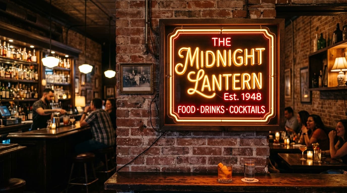
Walk through Southtown, the Pearl, or downtown San Antonio at night and you'll see a clear visual trend: retro-inspired neon-style signs are everywhere. From cursive script reading "Cocktails" above a craft bar to a 1950s diner-style "OPEN" sign in a Stone Oak coffee shop, the vintage neon aesthetic is having a moment. Custom signs in San Antonio that lean into mid-century, art deco, or roadside-Americana looks are pulling foot traffic in ways straight-modern signage can't match.
Here's why the comeback is happening and how San Antonio businesses are using it.
Why Retro Resonates Right Now
The retro signage trend isn't random. Three forces are driving it:
- Photo-driven culture, retro signs photograph beautifully and dominate Instagram, TikTok, and Pinterest
- Craft and heritage branding, businesses want to signal authenticity, history, and craftsmanship
- Differentiation, in a sea of minimalist sans-serif branding, retro signs stand out
For restaurants, bars, salons, and boutique retail, a single retro-style sign can completely shift the brand impression of the space.
What "Retro" Actually Means in Signage
"Retro" covers several distinct visual eras:
- Art Deco (1920s–30s), geometric, gold/black, ornate type
- Mid-Century (1940s–60s), bold colors, atomic shapes, optimistic typography
- Roadside Americana (1950s–70s), script lettering, motel signs, neon arrows
- 80s/90s Retro, bright pastels, geometric patterns, Memphis design influences
- Y2K / Early 2000s, chrome, gradients, futuristic optimism
Each era pulls different audiences. A craft cocktail bar might lean Mid-Century. A boutique vintage clothing store at the Pearl might lean Roadside Americana.
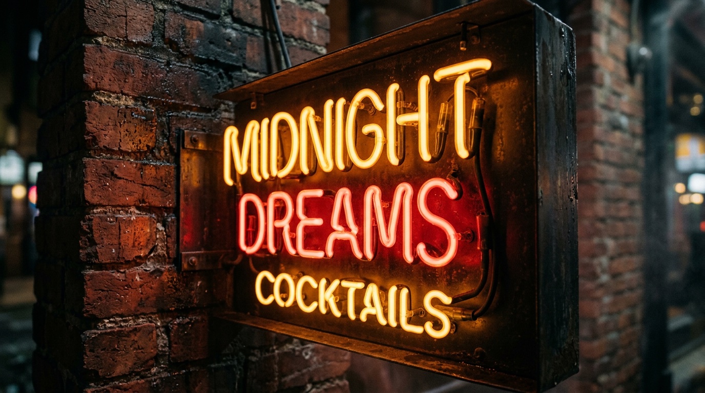
Best San Antonio Use Cases
The retro neon-style trend works particularly well for:
- Craft cocktail bars in Southtown and downtown
- Independent coffee shops in King William and Alamo Heights
- Boutique restaurants at the Pearl and St. Paul Square
- Vintage clothing and resale stores across San Antonio
- Tattoo parlors and barber shops with a heritage aesthetic
- Photo studios and event venues offering retro photo experiences
- Music venues and live performance spaces
- Pop-up retail and seasonal experiences
The San Antonio market is particularly receptive to retro signage because the city's history as a roadside-stop town between Texas cities created an authentic retro design language locally.
Modern Tech, Retro Look
The aesthetic is retro but the technology is modern. Most "retro neon" signs in San Antonio today are:
- LED neon-style, flexible LED tubing in vintage-style shapes and scripts
- Edge-lit acrylic, laser-cut acrylic with LED light bleeding through engraved letters
- Marquee-style with bulb LEDs, individual LED bulbs along painted backing for the Hollywood marquee look
- Painted signage on wood or metal, for the most authentic vintage feel (with optional LED accents)
The look is yesterday. The reliability, energy efficiency, and durability are all today.
Design Tips for Retro-Style Signs
To get the retro look right:
- Use period-appropriate typography, script for 50s diners, sans-serif geometric for 60s mod, ornate display fonts for Art Deco
- Stick to limited color palettes, usually 2–3 colors max
- Add visual texture, slight imperfections, weathering effects, or hand-drawn details make signs feel authentic instead of digital
- Consider the supporting environment, a retro sign in a hyper-modern minimalist space feels jarring; pair retro signs with complementary interior design
Pairing With Other Signage
Retro signs work best as the focal point, not the only element. Successful San Antonio installations pair them with:
- Printed menu signs in matching typography
- Window decals echoing the retro design
- Branded business cards that carry the aesthetic
- Foam board promotional signs in matching color palette
The single retro sign is the showpiece. The supporting print signage ties the brand together.
Where to Hang Them
For maximum impact:
- Behind the bar or counter (most visible to customers)
- Above the front entrance (sets the tone before entry)
- In the photo zone (Instagram bait, every photo carries your brand)
- In storefront windows facing the street
Common Mistakes
The most common retro signage mistakes: mixing too many era styles in one space, choosing cheap LED options that flicker, oversizing the sign so it dominates instead of complements, and skipping the supporting print signage that completes the brand picture.
Why Work With Inline Graphics
Inline Graphics is a San Antonio printing company that coordinates retro-style illuminated signage with matching printed materials, window decals, menus, business cards, and promotional signage, so the retro aesthetic carries across the entire customer experience.
Need custom printing in San Antonio? Inline Graphics helps local businesses, churches, schools, and event organizers design and print banners, signs, decals, displays, and marketing materials that get noticed. Contact us today for a quote.